What Is Intensity in Art and How to Use It
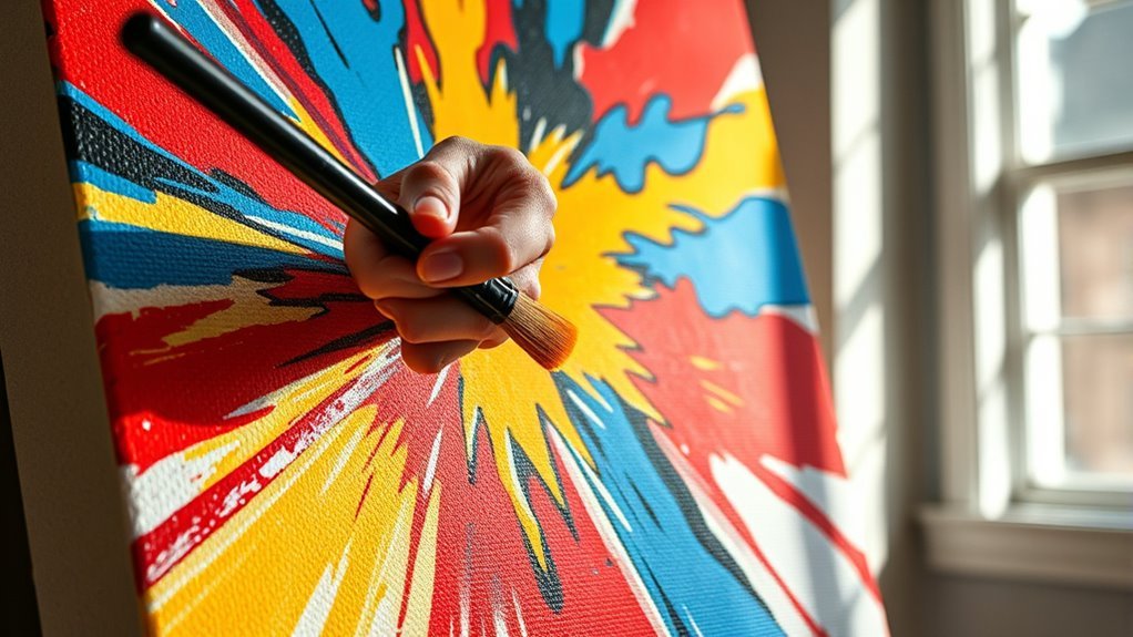
Intensity in art refers to a color’s vividness or saturation—basically, how bright and pure it looks. It’s a key element that can totally change the mood and focus of your artwork. When you adjust intensity, you’re controlling how much a color stands out or blends in.
Using high-intensity colors makes certain parts of your piece pop and grab attention right away. On the other hand, lowering the intensity helps create depth and softens areas, giving your artwork more dimension and subtlety.
One easy way to dull a color’s saturation is by mixing it with grays or complementary colors. Just remember, adding black or white mostly changes the value, not the intensity.
Keep experimenting with intensity—it’s a powerful tool to sharpen your visual impact and boost emotional expression in your art!
Key Takeaways
- Intensity, or saturation, measures a color’s vividness or purity, showing how bright or dull it appears. It’s basically how much a color pops or how muted it looks.
- When you add gray or complementary colors, it lowers the intensity. This mutes the color without changing its actual hue.
- High-intensity colors naturally grab attention and can create emphasis in your artwork. They’re great when you want something to stand out.
- On the other hand, low-intensity, muted colors help build depth and contrast. They also guide the viewer’s eye by creating a visual hierarchy.
- By adjusting intensity, you can control the mood and focus of your piece. It’s a powerful tool to enhance clarity and overall composition.
What Is Intensity and Why It Matters in Art
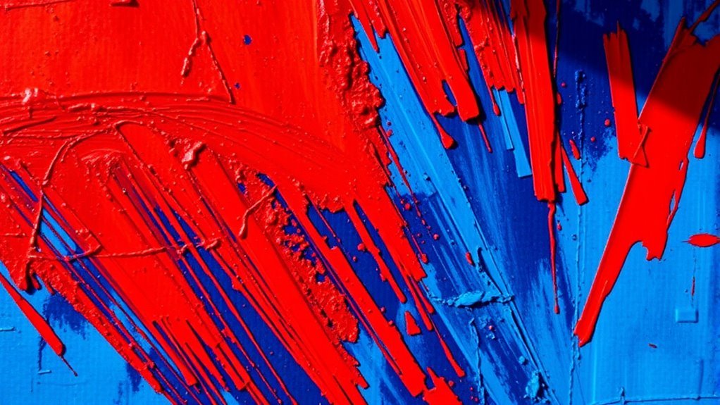
What exactly is intensity in art, and why should you care about it? Color intensity, also called saturation, measures a color’s vividness or purity.
A pure hue, like a primary color, shows high intensity—bright, vibrant, and free from grayscale elements like black, white, or gray. When you add gray or a complementary color, you reduce saturation, resulting in muted colors that appear duller or less vibrant.
This shift from high intensity to low intensity affects how colors pop or recede in your artwork, influencing mood and focus. Understanding intensity lets you control color vibrancy, helping you create depth, contrast, and harmony.
Without it, your piece might feel flat or visually confusing. By recognizing how color intensity works, you can make deliberate choices that enhance your art’s emotional impact and visual clarity.
How to Adjust Color Intensity to Enhance Your Artwork
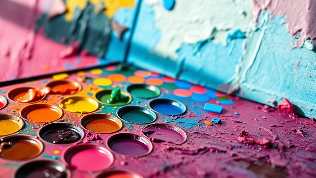
Although adjusting color intensity might seem tricky at first, you can easily control it by mixing your hue with its complementary color or adding gray. When you mix colors with their complementary colors, which contain all three primary colors, you create a duller, less vibrant tone that reduces color intensity by introducing dullness.
Adding gray, on the other hand, lowers saturation, making your colors appear more muted without changing the hue. Remember, mixing a hue with black or white mainly affects value, not intensity, so focus on complementary colors or gray to adjust vibrancy effectively.
Using pure color at high intensity draws attention, while muted tones recede into the background, helping you guide the viewer’s eye. By understanding complementary colors and saturation, you gain precise control over color intensity, enhancing your artwork’s mood and depth through thoughtful mixing colors and balancing vibrancy with muted tones.
Frequently Asked Questions
What Is Intensity in Simple Terms?
Intensity is how bright or dull a color looks. When you increase intensity, colors become more vibrant and eye-catching.
Lower intensity makes colors look softer or faded. This helps you create different moods in your artwork.
What Is the Difference Between Hue and Intensity?
Hue is the actual color you see, like red or blue, while intensity is how bright or dull that color appears.
You can adjust intensity without changing the hue to create different moods in your artwork.
It’s pretty cool because you get to play around with the same color but make it feel totally different just by tweaking the brightness or dullness.
What Are Intensity Colors?
Imagine a sunset blazing without a cloud—that’s intensity colors. You’ll find them as pure, vivid hues like bright red or blue, untouched by gray or dullness.
They make your art pop with life and energy. It’s like adding a spark that keeps everything glowing and exciting.
What Color Symbolizes Intensity?
You’ll find that bright reds, oranges, and yellows symbolize intensity. Using these vivid, saturated colors grabs attention and conveys energy.
They help your artwork express strong emotions and dynamic presence without needing dull or muted tones. It’s a simple way to make your work pop and feel alive.
Conclusion
Now that you know what intensity is and how to adjust it, you can bring your art to life with vibrant emotion and depth. Don’t be afraid to experiment—like a painter in the Renaissance discovering new colors, you hold the power to transform your work.
Play with color strength to create mood and focus, making your pieces truly unforgettable. Your art’s intensity is your secret weapon; use it boldly and watch your creativity soar. Remember, mastering intensity in art helps you add dynamic contrast and expressiveness, giving your work that extra punch.
So go ahead, explore different levels of intensity in your colors and brushstrokes. The more you practice, the better you’ll become at using intensity to guide your viewer’s eye and evoke powerful feelings. Embracing intensity in art is a fantastic way to make your creations stand out and connect deeply with your audience.