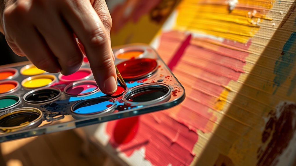
How to Understand the Definition of Color in Art
To understand color in art, you need to grasp how colors interact on the color wheel and how they evoke emotions. The color wheel is a key tool that helps you see relationships between hues like complementary, analogous, and triadic colors. These schemes show how colors can create contrast or harmony in your artwork.
You’ll also notice how warm and cool tones influence mood and depth, giving your pieces a certain feeling or atmosphere. Knowing these basics is super helpful when choosing colors deliberately. It makes your art balanced and impactful.
Keep exploring these ideas, and you’ll uncover deeper creative possibilities and emotional connections in your work. Color isn’t just about making things look good—it’s about expressing feelings and telling stories through your art.
Key Takeaways
- Color in art is defined by its hue, value, and saturation, which determine its appearance and emotional impact.
- The color wheel illustrates relationships between primary, secondary, and tertiary colors, aiding understanding of color mixing.
- Color schemes like complementary, analogous, and triadic organize colors to create contrast, harmony, and balance in artwork.
- Warm colors evoke energy and advance in composition, while cool colors create calmness and recede, influencing mood and depth.
- Understanding color harmony and cultural meanings enables intentional color choices that enhance visual impact and emotional expression.
Understanding Color Theory in Art
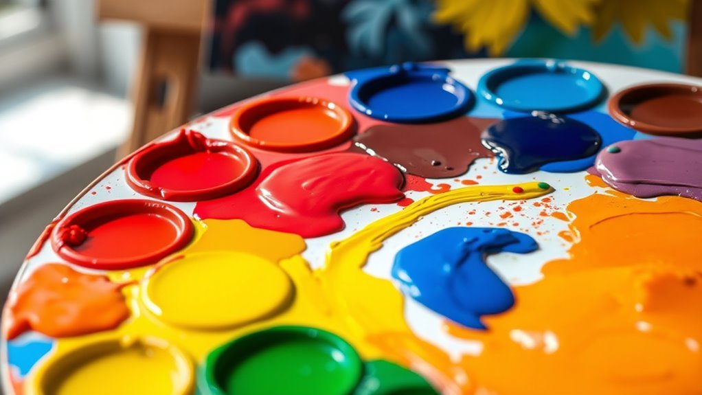
How do colors interact to create mesmerizing art? It all starts with the color wheel, a fundamental tool in color theory that helps you understand the relationships between primary colors (red, blue, yellow) and secondary colors (green, orange, purple), which you get by mixing primaries.
By exploring color schemes like complementary colors—those opposite on the wheel—and analogous colors, which sit side by side, you can create striking contrasts or smooth shifts. Using a triadic color scheme, which involves three evenly spaced colors, adds vibrant balance.
Exploring complementary, analogous, and triadic schemes creates dynamic contrasts and harmonious vibrancy in your art.
Warm colors like reds and yellows tend to advance in a composition, injecting energy, while cool colors such as blues and greens recede, fostering calmness. Mastering these concepts lets you achieve color harmony, ensuring your artwork feels balanced and engaging.
With this understanding of color theory, you gain the power to select and combine colors intentionally, making your art visually enthralling without guessing. It’s all about knowing what works and why—making your creative choices smarter and your art more captivating.
How Artists Use Color to Evoke Emotion and Meaning
Although color theory provides the tools, artists use color deliberately to evoke specific emotions and meanings in their work. When you see warm colors like red or orange, they often spark excitement or passion. Meanwhile, cool colors such as blue or green tend to calm you down.
Artists carefully choose color schemes—complementary or analogous—to create contrast or harmony that shapes your emotional response. They also adjust color value and saturation to emphasize moods. For example, vibrant color boosts happiness, whereas muted tones suggest melancholy.
Cultural associations add another layer, too. Like red can symbolize luck or mourning depending on the context. Understanding these choices helps you appreciate how artists communicate beyond the visual.
| Color Aspect | Emotional Effect |
|---|---|
| Warm Colors | Excitement, passion |
| Cool Colors | Calmness, tranquility |
| Vibrant Color | Happiness, energy |
| Muted Tones | Sadness, seriousness |
Frequently Asked Questions
How to Understand Color Theory in Art?
You understand color theory in art by studying the color wheel, experimenting with color relationships, and practicing mixing hues.
You’ll learn how colors interact, create moods, and enhance your compositions through hands-on exploration and observation.
It’s all about seeing how colors work together and how they make you feel.
Try playing around with different combinations and notice what happens—that’s where the real learning begins!
What Is the Definition of Color in Art in Simple Terms?
Color in art is the light your eyes see when it reflects off objects. You use it to show feelings, highlight areas, and create mood.
It makes your artwork more expressive and engaging. Colors really bring your work to life, don’t they?
What Is the 3 Color Rule in Art?
The 3 color rule recommends you pick a primary, secondary, and subtle accent to simplify and synchronize your shades. This strategy supports striking, stylish, and seamless compositions without color chaos.
It helps create mesmerizing and cohesive creations that really catch the eye. Using this rule makes choosing colors feel less overwhelming and more fun!
How Do You Describe Color in Art?
You describe color in art by naming its hue, noting saturation levels, and observing value for lightness or darkness.
You also consider temperature—warm or cool—and use shades, tints, and tones to detail variations.
It’s all about breaking down what you see so you can better understand and talk about the colors in a piece.
Conclusion
So, now that you’re officially a color expert, remember: it’s not just about slapping paint on a canvas. Colors don’t magically scream “emotion” or “meaning” without your savvy.
If you just throw red and blue together hoping for magic, you might get a mess, not a masterpiece. But hey, keep pretending you understand color theory—it makes your art sound way cooler at parties.
Just don’t forget, even a toddler’s crayon scribble can be called “expressive.” Understanding the definition of color in art means recognizing how colors interact, convey emotions, and create meaning. It’s about using color intentionally, not randomly, to make your artwork resonate. So, mastering color theory and its practical application can truly elevate your art from simple paint to a powerful visual language.